
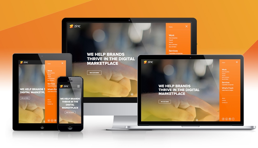
The days of website-slowing plugins and clunky mobile designs are fading fast; in their stead, responsive web design is taking over. This relatively new web design method is not just a hip trend in the world of web designers. It carries a bevy of benefits that marketers can take advantage of right now. That being said, here are six things that everyone needs to know about responsive web design:
1. Responsive web design doesn’t just make viewing a site on cell phones easier
Although responsive web design has become known as a method to make viewing one’s website on cell phones easier, this is not all that it does. It also makes using a company’s website much easier on all platforms. This includes giving visitors access to all of the features that a website has. Since many “mobile versions” of websites cull important website features, this is a huge benefit.
2. Responsive web design carries a single URL
As every marketer knows, if a website cannot get listed on search engine results lists, then it effectively does not exist on the web. Responsive web design helps an SEO campaign. One SEO benefit that a website gets is a single website address. With a mobile/desktop version website solution, the website includes at least two URLs for each page on the website. Responsive design, on the other hand, only requires one.
This greatly reduces redundancy, which can confuse both search engines and searchers, and makes internet presence enhancing linkbacks more powerful.
3. Google recommends using responsive web design
With over two-thirds of all of the billions of online searches going through Google, when they speak, everyone with even a fleeting interest in search engine marketing listens. Not long ago, Google’s Pierre Farr confirmed that the search engine giant prefers responsive web design above all other options. This is one of the least subtle hints that Google has ever given about how to improve one’s search engine rankings on their site.
4. Responsive web design increases website conversion rates
If a website gets a lot of visitors, but nobody is being converted into a sales lead, then it isn’t worth very much to the company using it. With a lot of fragmentation in the OS, screen sizes and web browsers used by searchers, poor conversion rates are increasingly due to a lack of usability on the site, as many web design styles simply cannot handle more than a couple of platforms very well. Due to the fact that a responsive design makes a website usable on any type of device, it doesn’t get in the way, no matter what device a visitor is using.
This benefit will continue to grow as mobile devices continue their takeover of the digital realm (nearly 60 percent of all American adults own a smartphone and 42 percent own a tablet; this doesn’t even account for teenagers).
5. A website with responsive web design is easier to manage than alternative solutions
A website design solution that is difficult to manage can cut deeply into a team’s man hours. Due to the simplicity of its structure — and the fact that one only needs to manage one website, instead of two or more — responsive web design requires much less effort to be managed than alternative options.
6. Responsive web design is the future; the future is right now
Any marketer not using responsive web design right now needs to incorporate it into their next website redesign. It will empower the marketer, streamline the experience for visitors and convince search engines to list a site higher.
To learn more or to talk to Zinc Solutions about a responsive website, contact us today.
