
For a majority of web designers, crafting for the “fold” has always been highly prioritized though this has recently changed. In the past, desktop computers were the only devices that one could access the World Wide Web with. Innovative technological advancements have led to the development and production of new devices such as tablets, smart phones and even internet enabled television sets which also allow users to browse the internet at home, in the office or while on the go.
Prior to the introduction of the “New Fold,” web designers were always careful towards ensuring that the most important website content or messages relayed via a website were placed close to the top. The “old fold” as this technique was referred to, derived its name from the use of traditional media channels, more so, the newspaper. It was common to find that on delivery, newspapers were often folded in two with the most important information often placed above the fold. This top area of a folded newspaper contained bold introductions, appealing imagery, essential information as well as other call to action components.
Web designers adopted the “above the fold” technique in the creation and designing of websites such that the most critical and eye catching elements and advertisements were strategically placed in this rather constrained area. This was a strategic technique aimed at appealing to web users in the opening five seconds upon visiting a given website. This was indeed an issue that led many marketing agencies to invest heavily as to how often content placed in the area resulted in the desired effects with regard to the posting of online advertisements.
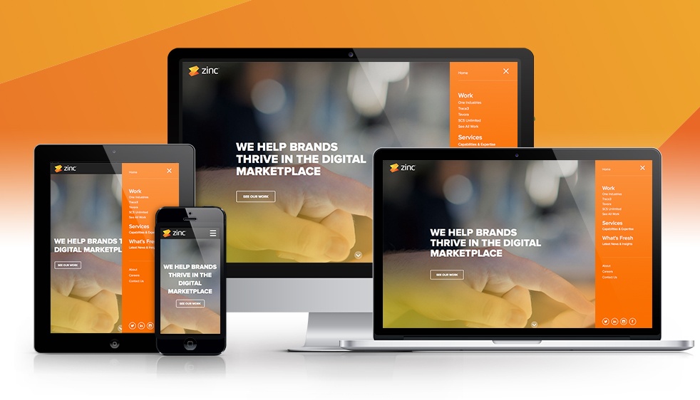
Web designers have become accustomed to designing websites by constantly considering which browser is most favored by users. Browsers tend to take varying screen proportions with respect to the size of an individual browser’s user interface as well as other additional toolbars. With modern day browsers, the space occupied has decreased significantly in an effort to desist from distracting users from their websites and improve the user’s browsing experiences. New mobile devices such as smart phones and tablets come with screen resolution and monitor size combinations which make it impractical to implement previous one size fits all forms of web design.
Designing for the “New Fold” involves web design techniques that employ ratio oriented folds which consider browsing in both portrait and landscape orientations. This calls for web designers to consider the second fold so as to appeal to users utilizing mobile devices. This new web design technique entitles designers to focus more on the overall quality of the website rather than delving to much as to where critical messages can be placed. The most appropriate design strategies which can be productively employed in a diverse array of motors and screens involve establishing some form of hierarchy for the whole design. As such, appropriate ratios rather than an over reliance on fixed pixel dimensions is employed.
The “new fold” does not call for the fold to be used as the center of attention rather this motivates designers to keep the primary message in what is referred to as a safe zone while at the same time preserving overall design quality. In essence, the “new fold” requires more detailed content and information to be placed in a manner that is easily readable with respect to its significance on a page. This new web designing technique has pushed designers to re-introduce other conventional design principles such as color theory, gestalt, layout and typography so as to have the desired user experience.
