
Here’s an interesting (and kind of startling) thought: business today is done more out of our pockets than in front of our desks at a computer.
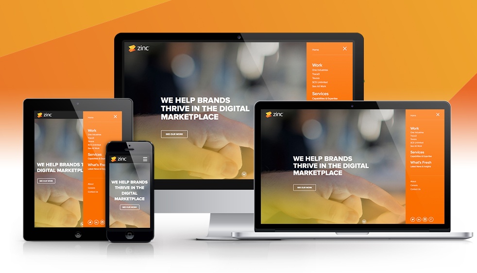
Mobile website design is becoming an increasingly important asset to your company. Having a mobile version of your site isn’t a “nice-to-have” anymore. It’s not even the latest trend- it’s a best practice that represents a user’s first (and sometimes only) impression of your business. If your website isn’t optimized and designed with smart phones and tablets in mind, you are missing out on a significant opportunity to reach your audience on the devices they spend the most time on.
Not convinced? Still think mobile sites aren’t quite as important as everyone is making them out to be? Check out these recent stats:
- There are over 1.2 billion (BILLION!) web users globally
- 25% of mobile users in the US only use mobile web (they don’t access sites from desktops at all)
- Mobile sales are increasing by 85%
- 90% of mobile searches result in some kind of action
- 55% of consumers use their mobile devices to buy services and products
So what should you take from this data? Here are two things we got.
You Need a Mobile Website
A mobile web design is necessary these days- but equally important is a fully functional one. Limiting content or users’ capabilities isn’t an acceptable mobile web strategy when a quarter of Americans are only browsing online with their smart phone or tablet. Your site should have a mobile web design that restructures your content into smaller views and hints at secondary content in smarter ways. Your content and functionality needs to be readily available on mobile devices, but should be trimmed down to its leanest version.
Your Mobile Website Needs to Be Efficient
On mobile devices, processing power is very limited and data is only accessible through shared networks. It’s hard to get the same web experience on a device as one would get on a desktop- but with so many of your users on mobile devices, it’s important to accommodate their technology. This can be done through code written with mobile browsers in mind and in a way that optimizes the information being conveyed.
