
As a leading web design agency in Orange County, Zinc Solutions keeps tabs on web new trends and shifts in technology. Users have expectations and preferences that match these shifting technologies, and web designers need to adapt to these changes and cater to the needs of their audiences. 2015 will bring many changes to the web design arena- and we’ve identified 5 major trends you can expect to see in the New Year.
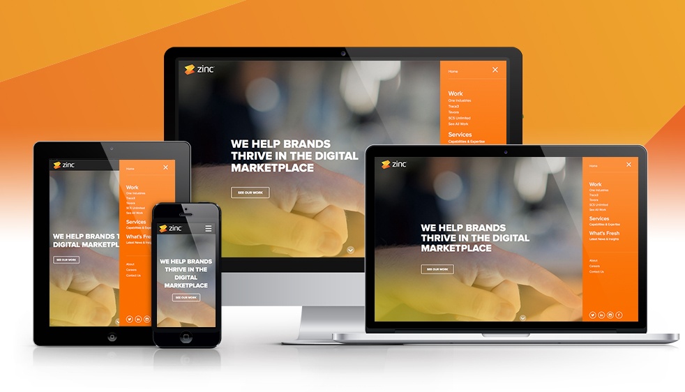
Responsive Sites
The need for responsive web design remains. In fact, it will only become more vital for sites to perform on a range of different devices. In the coming year, there are expected to be more mobile viewers than there are viewers on personal computers. This means that sites will have to be responsive to all types of devices if they want to avoid frustrating users.
Large Background Images and Videos
The web is expected to be awash in big, beautiful background images and compelling background videos in 2015. This is an easy and tasteful way to appeal to visitors. Designers should do their best to use images and videos that represent the image and message of the company. Users are no longer satisfied with boring stock images that have little to do with the site they are visiting.
Emphasis on Typography
There are so many interesting styles in typography; it is a shame that many sites stick to the ordinary. Web design in 2015 is expected to explore the possibilities of typography, with big, bold fonts and original messages that work with those fonts. It can be as simple as a welcoming message or a snippet about what the company does, but users are looking for text to catch their eyes and move them along in the site.
Long Scrolling Pages
Users are used to interactive screens, and they are accustomed to scrolling with their fingers when they’re on their mobile devices. This is why long scrolling pages are seeing a rise in popularity- they cater to the way users are becoming accustomed to behaving online. Long scrolling pages allow the user to scroll through large amounts of information without ever needing to click a button or make a decision whether to stay on the site. This web design element keeps users on websites for longer, as well as providing content in a way that is natural to expectations.
Takeover Navigations
This one is new- especially as mobile and responsive sites become more common. Navigation, instead of appearing as the typical links on the top of a page, is being represented with three horizontal lines. In a takeover navigation, users click on these lines to expand the site’s navigation links. Where there used to be a drop down, there is now an element that takes over the site with a new visual and a new set of navigation tools. This web design approach can be quite compelling, and users can always exit out of it easily if they choose. This takes advantage of the full-screen experience, when the designer wants to elegantly move the visitor on to something new.
If you’re looking for a fresh website that incorporates these and more critical new trends for 2015, we’d love to talk to you.
