Thoma Bravo Rebrand & Website Design
Our Approach
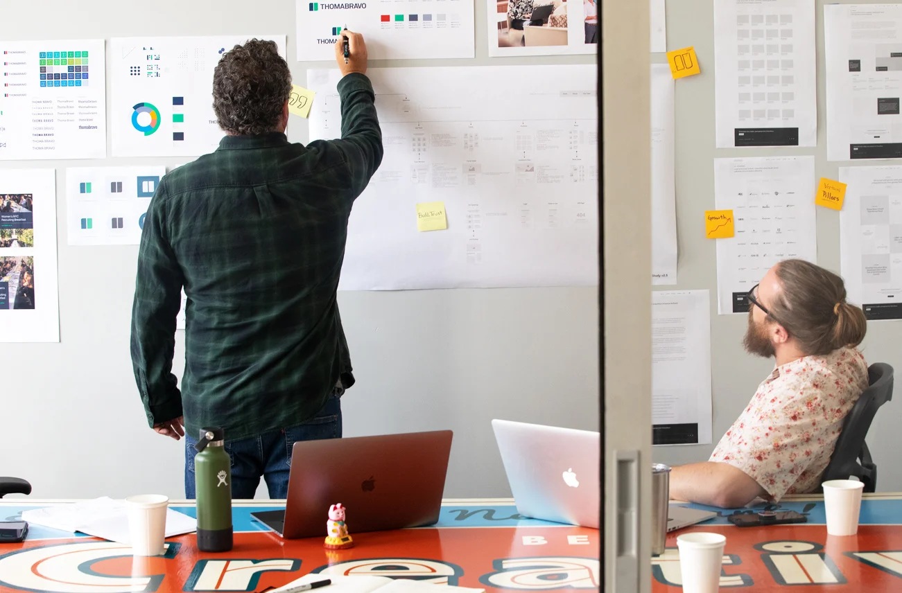
Getting the strategy right was the first step in the process — and everything else grew from there. We quickly identified the limitations of the existing brand experience during an in-depth discovery and research process including an onsite kickoff with Thoma Bravo managing partners and executives. This experience helped us to intimately understand the dynamics of the company and the core values that we needed to address in the rebranding project.
Knowing how to be a brand that effectively speaks to both CEOs and investors, resulting in a successful partnership for all is a challenge — but it’s made easier if you understand the high level business goals, and how every external-facing touchpoint ties in to those goals.
Branding
Brand discovery revealed Thoma Bravo's unique market position as true partners helping portfolio companies shape the future. We positioned their brand around this core value, prominently featuring CEO relationships in all touch points.
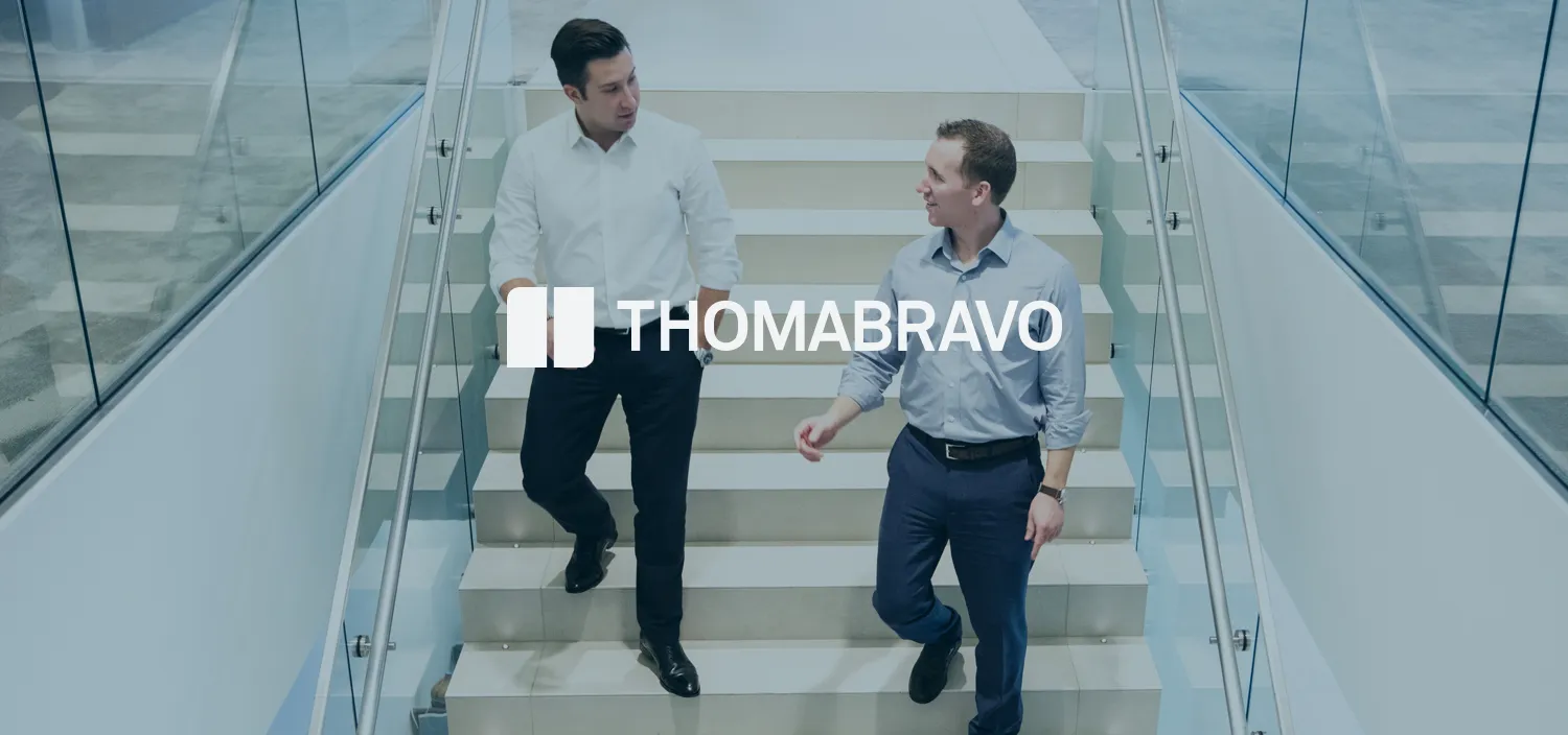
We transformed their identity with a bold, editorial approach capturing their humble personality and business expertise. The design system feels both sturdy and visionary, using clean simplicity and deliberate juxtaposition to communicate "two complementary entities working toward a common goal." A bold color palette and candid photography emphasize their energetic, approachable nature.
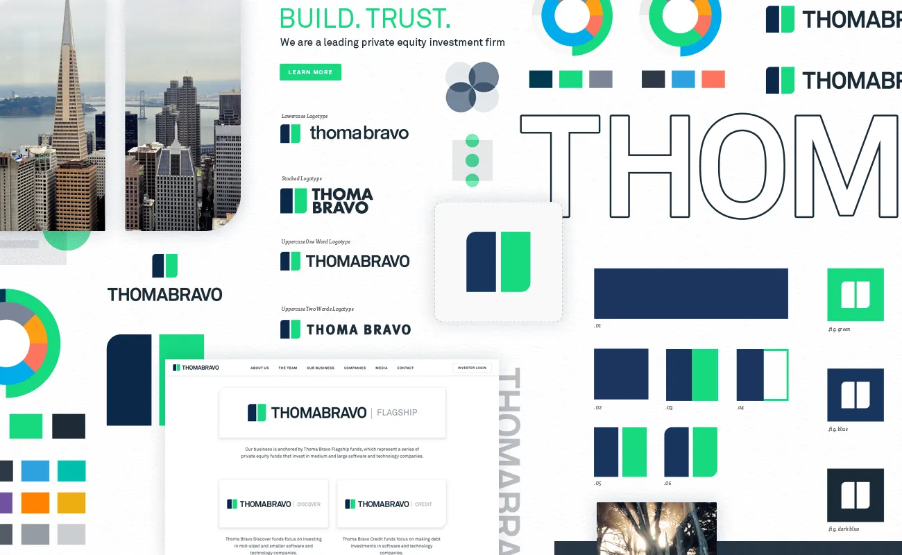
Visual Identity
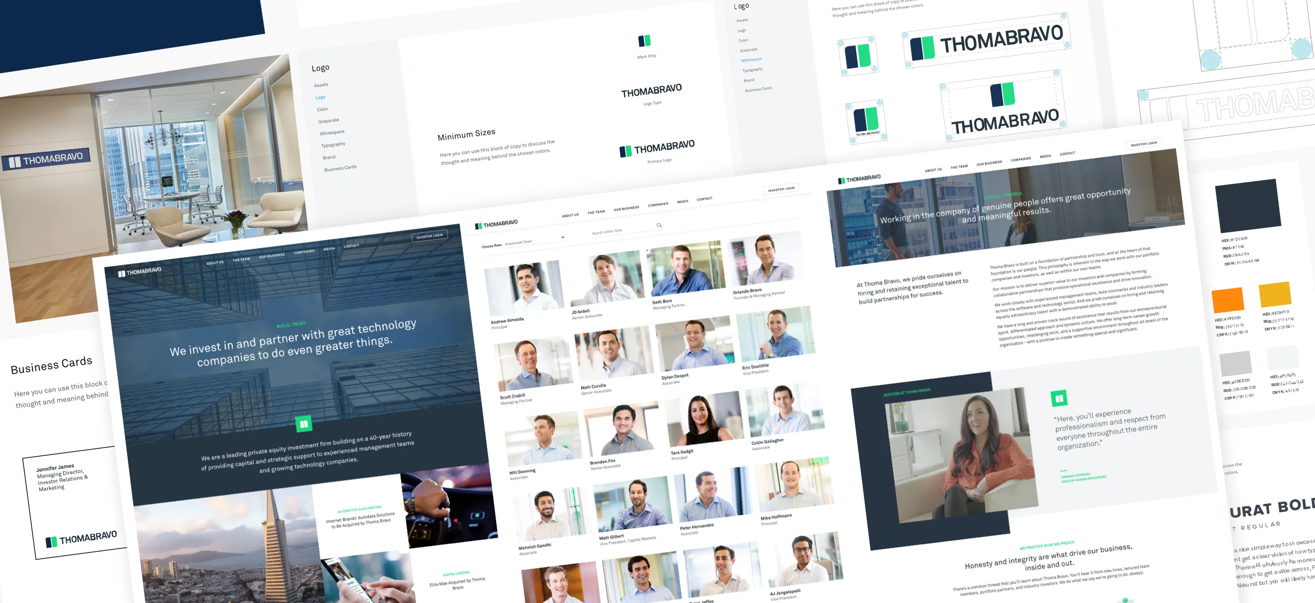
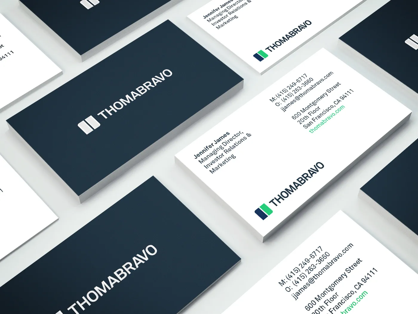
We replaced the existing logo to create an identity honoring Thoma Bravo's history while projecting future vision. Our story emphasized partnership, speaking to the next generation of private equity.
The blue enclosure evolved into dynamic 'Partnership Pillars'—a mark in perpetual motion symbolizing Thoma Bravo's agile collaboration with CEO teams for maximum efficiency and acceleration. The mark resolves into a short-form icon. While keeping the core blue identity, we introduced 'Thoma Bravo tech green' for contrast, helping differentiate from competitors and cut through visual noise.
Theory
We named the Thoma Bravo mark "Partnership Pillars" as a nod to the company ethos and the balance of complementary entities working together towards a common goal — a perfect fit for their commitment to partnership.
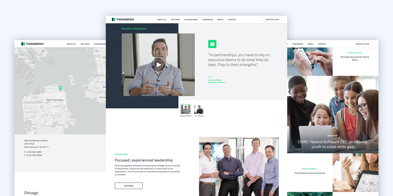
Website
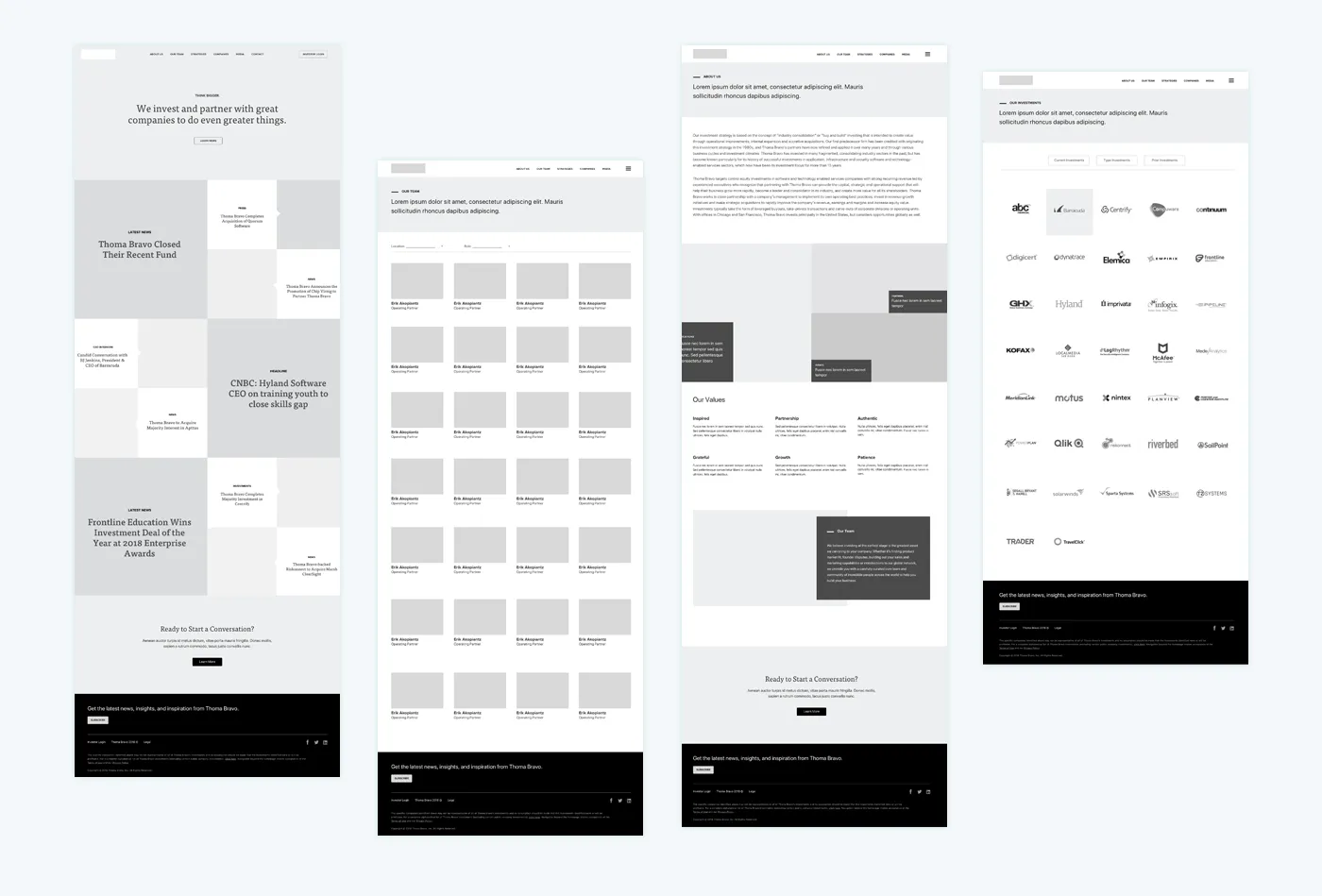
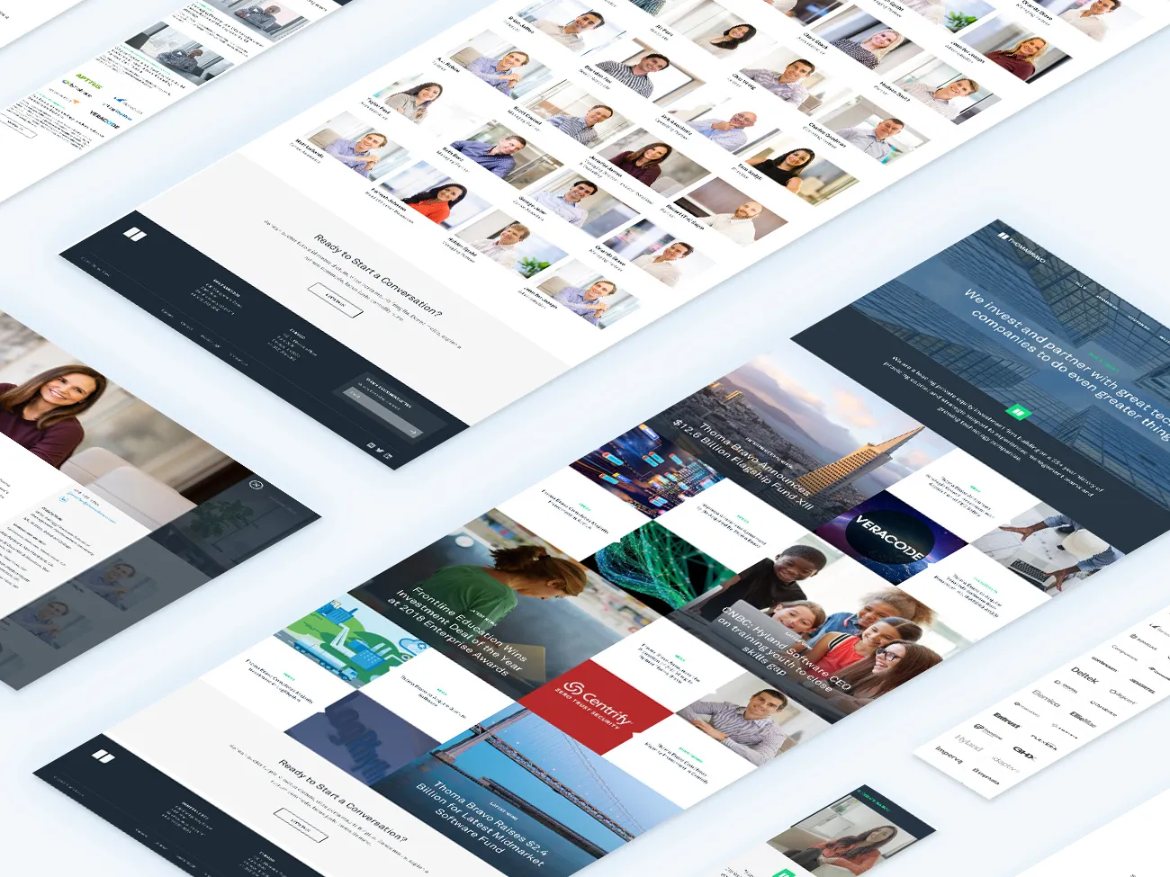
Most noticeably, the existing website was unrefined and outdated with boxy formatting, lackluster photography, and dull colors. It was overdue for a redesign - one that could differentiate Thoma Bravo to reflect their leadership in private equity and be a resource for company CEOs, Limited Partners, and potential new hires looking to learn more.
Through the look, feel, and voice, we elevated the Thoma Bravo brand to match their top-tier reputation and the caliber of companies they partner with. Ultimately, we were able to promote their partner focused company culture, and design a fluid website that could communicate their rapid pace of success, and how innovative their firm is — while capturing everything Thoma Bravo delivers.
Photography
We laid the foundation for custom photography with a photo style guide. It outlined a visual language and target personality, then articulated the unique visual opportunities within the brand strategy and how to shoot for them. Before the on-location shoot, we created and tested sample imagery in-house to hone the style and direction.
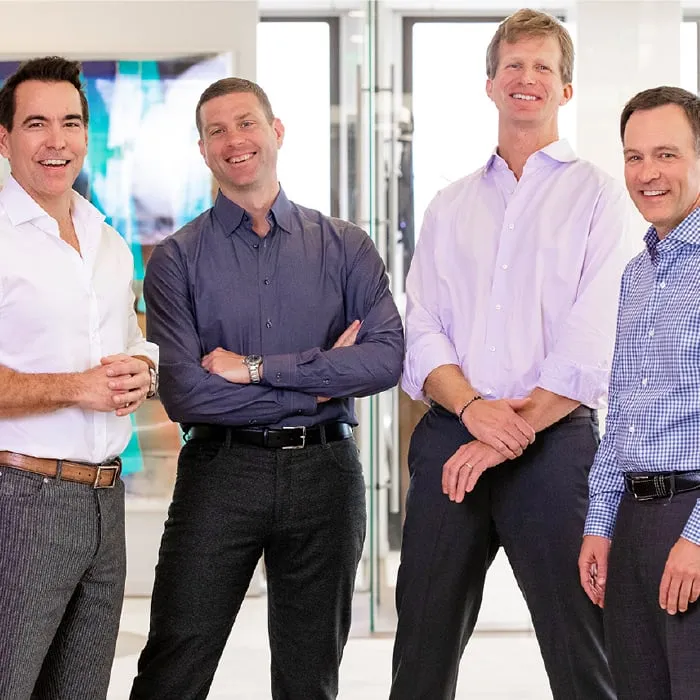
To capture the Thoma Bravo culture, we conducted onsite photo sessions in San Francisco and Chicago. We scouted for the photo style and strategy, then shot with the Thoma Bravo team over multiple days at both locations. Custom portrait photography was a great way to raise the believability and authenticity bar on the new Thoma Bravo website.


Videography
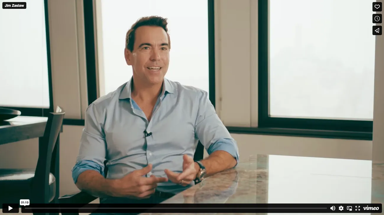
Because of the unique culture of Thoma Bravo, we felt company videos would distinguish them from others in the private equity space. The approach we took was to merge the company's personality, professionalism, and ethic into forward-facing promotional videos that deepens their footprint while allowing potential partners to look into their culture. We wanted to give Thoma Bravo something ownable and consistent with the new brand identity.
Marketing Design Support.
ZINC has crafted a diverse portfolio of successful website design projects—browse through vibrant visuals that highlight our expertise across industries and styles. Experience how we deliver standout digital solutions, every time.


More Work, More Impact
Explore additional ZINC projects that showcase how strategy and creativity come together to drive measurable results.


Navigator Global
FAQs
Get answers to your most pressing questions about our web design services.
Our typical turnaround time for web design projects is between 6 to 12 weeks. This timeframe can vary based on project complexity and client feedback. We prioritize quality and ensure every detail meets your expectations.
Costs for our web design services depend on various factors, including project scope and features. We offer customized quotes to fit your specific needs. Contact us for a detailed estimate.
Answer Engine Optimization prepares your website to be understood and featured in AI search results. Instead of optimizing just for Google keywords, AEO ensures your content answers real questions clearly so AI systems surface your brand first.
We design websites using various platforms, including WordPress, Shopify, and custom solutions. Our choice depends on your business needs and goals. We ensure the best fit for your project.
We structure copy, metadata, and FAQs to align with conversational AI queries. By combining schema markup, semantic copywriting, and high-quality content, we help brands appear in answer boxes and AI-powered search responses.
Unlock Your AI Potential Today
Discover how AI can transform your business.